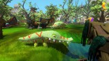
My girlfriend handed the controller back to me after an hour of playing Viva Pinata.
\"It has too many buttons,\" she said. I took the controller back with some dismay. As a casual gamer, she didn\'t care for first person shooters or Gears of War, but I\'d picked up Viva Pinata with confidence. It was addicting, slow paced, and creative; Viva Pinata had everything I expected her to appreciate. She\'s loved games like Pikmin, Prince of Persia, and The Sims, and she\'s never handed the controller back on a game and told me it had \"too many buttons.\"
\"No it doesn\'t,\" I said. \"It\'s got the same number of buttons as any other game.\"
But when I started playing Viva Pinata for myself, I quickly realized that I was wrong, because while Viva Pinata is a brilliantly addictive game that ultimately hooked both myself and my girlfriend, it is a context sensitive spook story. It is a perfect example of context sensitive controls gone wrong, and if Viva Pinata were a faster paced game it would have been inexcusably frustrating.
Context Sensitive buttons are simply buttons that do different things when in different situations. Standing next to a door, for example, the A button might open it. Standing beside an ammo crate, though, and the A button might reload your weapon. One button results in two different actions.
Five years ago developers used to brag about their context sensitive buttons; context sensitivity allowed 10 button controllers to behave as if there are actual 12 buttons. But Viva Pinata also proves that it can be mismanaged.
Fundamentally, Viva Pinata\'s problem is its propensity to move buttons around for no reason. One button on the Xbox 360 controller might take you back a screen in some places, might confirm your order in others, and might draw up a menu in another. The meanings of the buttons change from screen to screen for no real contextual reason; as you play, you\'ll accidentally cancel orders, back out of screens when you didn\'t want to, and generally get frustrated.
The Viva Pinata control scheme lacks continuity of thought. Here\'s an example. Most games use one primary button to move back a screen, normally the red B button on the 360 controller. In Viva Pinata, though, there are at least three buttons that serve the \"back\" function at different points in the game. Sometimes it\'s the \"back\" button (select), sometimes the red button, sometimes the yellow.
Another example is simply the complexity of completing a task. Purchasing an item in Viva Pinata is like trying to buy something in the PS3\'s online store, you have to confirm or deny everything. You push A to select an item, then A again to confirm you like the item, then A to place the item in your garden, then Y to check out, then A to confirm you want to check out, then Y again to return to a place where you can select the next item.
After playing it for a little while, I realized that my girlfriend was right: Viva Pinata has too many buttons.
As much as I love the game, it should stand as a warning to designers. Consistency of design matters, even more so in games that break from genre guidelines. It\'s my only complaint in an otherwise near perfect game. It\'s interesting that past \"features\" sometimes simply make things more complex.

;
NewWindow.focus(); void(0);)
;
NewWindow.focus(); void(0);)
;
NewWindow.focus(); void(0);)
;
NewWindow.focus(); void(0);)
;
NewWindow.focus(); void(0);)
;
NewWindow.focus(); void(0);)
;
NewWindow.focus(); void(0);)
;
NewWindow.focus(); void(0);)
;
NewWindow.focus(); void(0);)
;
NewWindow.focus(); void(0);)